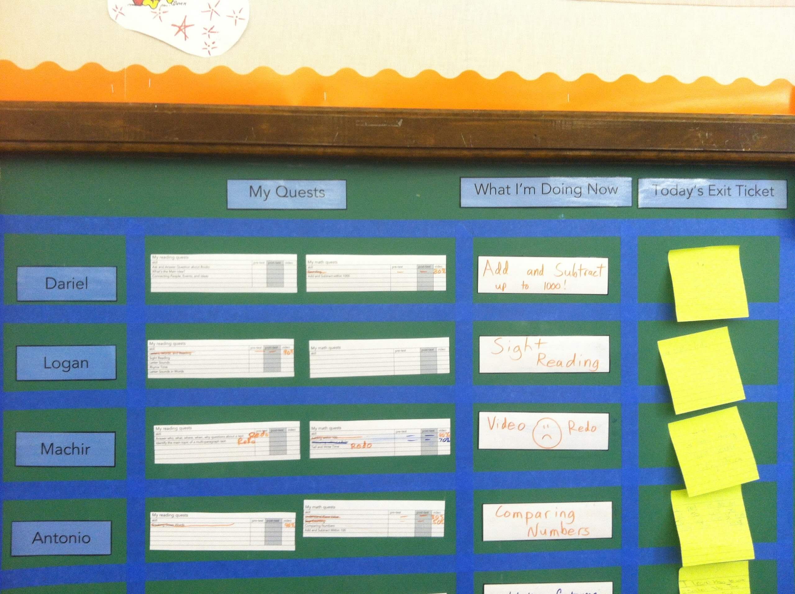
At the nexus of educational psychology and user experience design, learning progress visualisation presents a challenge that goes beyond simply monitoring accomplishments to include developing meaningful representations that inspire, educate, and mentor students as they proceed through their academic careers. The design of dashboards and progress trackers has become a crucial component of student engagement and learning outcomes as educational technology advances, necessitating a sophisticated strategy that strikes a balance between user comprehension and data complexity.
Deep insights into human motivation and learning behaviour can be gained from the psychology of progress visualisation. The progress principle, as defined by psychologists, is the increase in motivation and engagement that occurs when students can clearly perceive their progress. The design of contemporary educational dashboards is influenced by this basic feature of human psychology, where the skill is in producing visuals that inspire as well as inform. By utilising this psychological framework, the best designs avoid the traps of comparison-based discouragement and communicate progress in ways that inspire intrinsic motivation.
The difficult balance between thorough data presentation and cognitive accessibility must be struck by modern learning dashboards. The most effective systems carefully layer data so that users may go from high-level overviews to in-depth analytics without feeling overloaded. Learners may obtain exactly the level of data they require at any given time thanks to our progressive disclosure strategy, which supports both rapid progress checks and in-depth analyses of learning patterns.
Beyond just being aesthetically pleasing, colour theory is essential to successful progress visualisation. Carefully chosen colour schemes accomplish a number of goals, including establishing visual hierarchies, emphasising crucial information, signalling status changes, and even influencing how people feel about progress indicators. Effective learning platforms deliberately integrate colour, utilising standardised colour schemes that improve understanding while still being usable by users with different types of colour vision impairments.
There are particular difficulties in visualising learning development because of its time component. In order for learners to comprehend their progress over a variety of time scales, effective dashboards must show both short-term accomplishments and long-term improvement. Interactive timelines, trend analysis, and adaptive goal-setting frameworks that adapt to the learner’s speed while retaining tough but attainable targets are some of the ways that modern designs achieve this.
Effective progress visualisation now heavily relies on personalisation. Modern dashboards modify their visual representations according to user choices, objectives, and learning styles. The kinds of indicators shown, the amount of detail offered, and the regularity of progress updates are all examples of this customisation, which goes beyond simple aesthetic preferences. Providing significant personalisation while preserving the consistency and clarity required for efficient learning monitoring is the difficult part.
Progress visualisation is further complicated by the social aspect of learning. Although the focus is still on individual development, many educational systems also include collaborative components that need to be carefully represented visually. Through selectable social features and carefully chosen peer group analytics, successful designs minimise the negative consequences of continual social comparison while promoting healthy competitiveness and cooperation.
Modern educational dashboard design has made mobile responsiveness a must. Progress visualisations must adjust to various screen sizes and interaction styles while retaining their efficacy across devices. Because of this difficulty, data presentation has become more creative, with designers creating new methods to condense complicated data into mobile-friendly formats without sacrificing crucial insights.
Every element of the design of progress visualisations takes accessibility into account. Dashboards that are effective must clearly communicate progress to users with different learning styles and abilities. Everything from colour schemes and contrast levels to the availability of alternate text descriptions and keyboard navigation options are influenced by this inclusive approach. The intention is to make sure that progress tracking enhances rather than detracts from a learner’s academic path.
Micro-progress indicator integration has become a potent motivating tool. Larger learning objectives are broken down into smaller, more digestible pieces by these small-scale visualisations, which also offer regular feedback and sustain engagement by instantly recognising progress. Designing these micro-indicators to complement rather than detract from more general learning objectives is the art.
When carefully incorporated into progress visualisation, gamification components can greatly increase user engagement. Successful implementations, however, steer clear of oversimplification and make sure that game-like components complement real learning objectives rather than replace them. Gamification is used in the best designs to emphasise significant progress while upholding the gravity of academic success.
Visualising learning progress is expected to become more complex and nuanced in the future. New approaches to representing and interacting with learning data are promised by emerging technologies like artificial intelligence and augmented reality. Nonetheless, even as technology advances, the core ideas of successful visualization—clarity, inspiration, and meaningful depiction of advancement—will not change.
Flexible visualisation systems that can adjust to new methods of assessing learning progress are necessary since assessment and evaluation metrics in educational contexts are always changing. Both conventional academic metrics and more recent assessment methods, such as competency-based evaluation and project-based learning outcomes, must be supported by modern dashboards. This adaptability guarantees that progress monitoring stays pertinent and significant across various pedagogical philosophies and goals.
The ability of educational progress visualisation to facilitate and improve the learning process is ultimately what determines its success. Effective dashboards and progress trackers must offer learners clear, inspiring, and actionable data that help them understand where they are, where they’re heading, and how to get there—whether they are tracking academic accomplishment, skill development, or personal improvement. Design, technology, and educational psychology must constantly innovate to meet this complicated issue and produce solutions that genuinely meet the demands of contemporary learners.

Comments are closed.