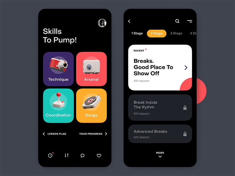
Designing educational interfaces sits at the crucial intersection of learning theory, visual design, and cognitive psychology. Beyond creating visually appealing user interfaces, edtech product designers must build digital environments that actively support cognitive processing and foster deep learning. This comprehensive exploration outlines strategies for creating user interfaces that align with human cognitive architecture.
Understanding the Cognitive Foundation
The design of instructional interfaces exists at the critical convergence of cognitive psychology, graphic design, and learning theory. Edtech product designers need to craft digital environments that actively promote cognitive processing and deep learning, rather than focusing solely on aesthetics. This analysis explores methods for creating user interfaces that enhance human cognitive architecture.
The Three-Tier Cognitive Architecture
Modern educational interfaces must address three distinct types of cognitive processing:
- Fundamental Processing: Comprehending core concepts.
- Generative Processing: Merging new knowledge with existing knowledge.
- Superfluous Processing: The cognitive effort required to navigate and analyze the interface itself.
Designers aim to optimize the first two types while minimizing superfluous processing to enhance learning effectiveness.
Practical Implementation Strategies
Consider a typical learning management system dashboard. Traditional designs often overwhelm users by displaying all courses, assignments, and notifications simultaneously. This approach can create unnecessary cognitive load. Instead, a strategy referred to as “cognitive scaffolding” should be implemented—creating a tiered interface that gradually reveals information based on the user’s current learning state and focus area.
In practice:
- Upon login, students see a concise representation of their current priorities.
- The interface uses subtle visual hierarchies to direct attention to the most relevant content.
- As users engage with specific elements, the interface gradually reveals more content and deeper learning pathways, creating a narrative flow aligned with the natural learning process rather than simply hiding and revealing information.
Advanced UI Patterns for Cognitive Support
Motion design plays a critical role in managing cognitive stress. Carefully designed animations can serve as cognitive markers, helping students track their progress through complex content and understand connections between ideas. For instance, when a student completes one concept and moves to a related one, a gentle animation can visually demonstrate the relationship, strengthening their mental model.
Additionally, interfaces should include “cognitive rest zones”—carefully planned spaces that allow students to pause, reflect, and solidify their understanding. These areas maintain engagement without adding cognitive load, providing a balance between visual interest and mental clarity.
Micro-Interactions and Learning Reinforcement
Every interaction within an educational interface should serve two purposes: facilitating immediate task completion and reinforcing learning objectives. For example, handling error states can go beyond highlighting mistakes—micro-interactions can gently guide students toward understanding their errors in a supportive and natural manner, avoiding punitive or discouraging feedback.
Data-Driven Cognitive Design
Modern educational interfaces must be equipped to collect and respond to indicators of cognitive stress. By analyzing patterns such as response times, error rates, and navigation habits, designers can create interfaces that adapt to each user’s cognitive limits. These adjustments might involve changing the pace of content delivery or modifying the density of displayed information, providing a tailored and supportive experience.
The Role of Visual Design in Cognitive Support
Colour, typography, and spacing are not merely aesthetic choices; they serve as cognitive aids. Well-designed colour schemes can reduce cognitive strain by establishing visual hierarchies and connections. Typography choices—such as line length, spacing, and contrast—should maximize readability and comprehension, creating an interface that feels intuitive and supports learning.
Future Directions and Considerations
The cognitive support capabilities of instructional interfaces will continue to evolve. Emerging technologies, such as eye-tracking and attention monitoring, may enable real-time cognitive load assessment and adaptive interface modification. However, these advancements must be carefully balanced with privacy considerations and the need to maintain a stable, predictable learning environment.
Conclusion
Creating educational interfaces that effectively support learning objectives and manage cognitive load requires a deep understanding of cognitive psychology and interface design principles. Successful platforms will blend these elements to produce learning environments that actively promote knowledge acquisition and retention. The future of educational interface design lies not in adding more features or eye-catching visuals, but in developing subtler, more effective ways to support human cognitive architecture. By thoughtfully considering the cognitive impact of each design element, we can create learning environments that engage and empower learners.


Comments are closed.