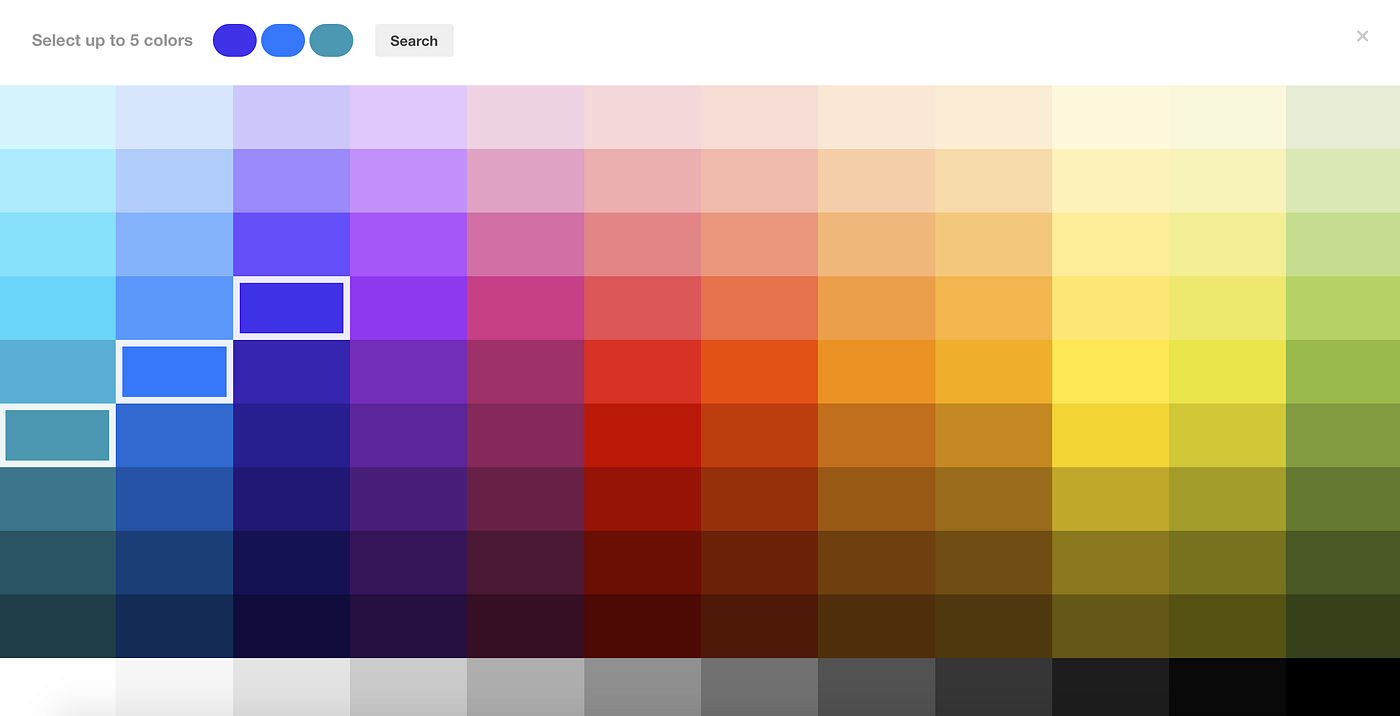
One of the most potent instruments in an educational designer’s toolbox is colour, which has the capacity to profoundly affect emotional states, cognitive processing, and learning results. Colour becomes more than just decoration when used carefully in educational technology; it becomes an essential component that influences the entire learning process. By comprehending the psychological effects of colour selections, we can develop instructional platforms that are more efficient, engaging, and easily accessible.
The Cognitive Impact of Colour
Beyond aesthetic choice, there is a deeper connection between colour and cognitive processing. Colour has been repeatedly found to have a major impact on learning efficiency, attention span, and memory retention. Blue, which is frequently connected to intellectual endeavours, has shown impressive impacts on focus and memory. When used as the primary colour in learning interfaces, it fosters an atmosphere that encourages concentrated study and critical thinking, making it especially useful for tasks that require intense focus, such as mathematical problem-solving or reading comprehension.
Green, typically associated with development and innovation, is a great colour choice for fields that require creative problem-solving and imaginative thinking. Studies show that being around green can enhance creative performance, making it perfect for project-based learning modules or brainstorming tools. The colour also works well for achievement markers and progress indicators due to its inherent associations with growth and progress.
Red, despite its potency, should be used sparingly in instructional interfaces. Its attention-grabbing qualities make it ideal for emphasising critical details or highlighting mistakes that need quick correction. However, overuse may lead to heightened tension and anxiety, potentially impeding learning outcomes. Strategic deployment is key, using red deliberately and sparingly to highlight essential components without overwhelming users.
Emotional Resonance and Learning Environment
The emotional influence of colour is crucial to creating productive learning environments. Warm hues like gentle oranges and yellows can foster welcoming, vibrant settings that encourage engagement. These colours are especially effective in elementary school interfaces or sections designed for collaborative learning, where sustaining enthusiasm and positive energy is vital.
Conversely, cool hues, such as various shades of blue and green, help create calm, focused environments ideal for solitary study and concentration. In areas devoted to test preparation or complex problem-solving, these colours are particularly helpful for reducing tension and enhancing focus.
Balancing warm and cool colours in an instructional interface requires careful consideration of the platform’s purpose and intended audience. For example, an elementary school app might use more warm, engaging colours to maintain interest, while a high school study platform might prioritise cool, professional tones to keep users focused.
Cultural Considerations in Colour Selection
Cultural differences in colour perception and meaning make it essential for educational designers to consider their global audience. A colour perceived as a symbol of achievement or success in one culture might carry negative connotations in another. This cultural sensitivity is even more critical when designing for diverse student populations or international platforms.
For example, white can signify mourning in many Eastern cultures, whereas it often symbolises purity and clarity in Western societies. Similarly, purple may not consistently represent royalty and wisdom across cultures. Thorough research into the cultural meanings of colour and incorporating customisation options to accommodate different cultural preferences is crucial for effective instructional design.
Accessibility and Inclusive Design
To create genuinely inclusive educational experiences, careful consideration of colour accessibility is crucial. While the Web Content Accessibility Guidelines (WCAG) 2.1 provide essential standards for contrast and accessibility, excellent design goes beyond simple compliance. Ensuring a minimum contrast ratio of 4.5:1 between text and background colours is vital for readability for people with varying visual abilities.
Since approximately 8% of men and 0.5% of women globally experience colour blindness, interfaces must remain usable and meaningful when viewed through different forms of colour vision impairment. This consideration extends beyond using colourblind-friendly palettes to incorporating multiple visual cues, ensuring that colour is never the sole means of conveying information.
Implementation Strategies for Educational Platforms
Effective colour use in instructional interfaces begins with a simple, constrained colour scheme. Typically, two to three primary colours are used within a well-designed system, with a few accent colours strategically placed throughout the platform. This limited palette avoids cognitive overload while maintaining visual consistency.
The primary colour scheme should reflect the platform’s educational goals. For example, a science learning platform might use blues and greens to promote focus and critical thinking, with carefully chosen accent colours to highlight key content or interactive features. The key is creating a visually cohesive colour scheme that supports learning objectives.
Colour and Information Hierarchy
Colour is crucial for creating distinct information hierarchies within instructional interfaces. By using consistent colour coding, designers can help students quickly identify different types of content, activities, or subject areas, reducing cognitive load and improving navigation.
For example, distinct subjects may be assigned unique colours—blue for mathematics, green for sciences, and purple for languages. This consistent coding helps students locate relevant content and understand their position within the broader learning environment.
The Future of Colour in Educational Design
The evolution of educational technology presents new opportunities for dynamic and personalised colour application. Adaptive interfaces that adjust colour schemes based on the time of day, student preferences, or learning patterns represent the future of instructional design. Integrating AI may eventually enable platforms to optimise colour schemes in real-time based on factors related to engagement and individual student performance.
While embracing new technological advancements, the foundational principles of colour psychology in education remain unchanged. The goal is to create learning environments that support cognitive processing, reduce cognitive load, and maintain engagement, ensuring accessibility for all users.
By blending aesthetic considerations with psychological principles, educational designers can craft more effective learning experiences through the thoughtful use of colour. As our understanding of the relationship between colour and learning deepens, our ability to create impactful educational experiences will only continue to grow.


Comments are closed.